 It’s here! The highly anticipated second iteration of Xcel Energy’s hosting capacity analysis has been published. The tool provides public transparency into the results of 1,047 feeder models analyzing the ability of the grid to host distributed energy resources (like a community solar garden) without adversely impacting power quality or reliability.
To put it simply, thanks to the advocacy of Fresh Energy and our partners – as well as strong leadership by the Minnesota Public Utilities Commission and Xcel Energy – we now have a user-friendly tool that tells us where new energy systems can most efficiently connect to the grid. For a full rundown of what it took to create this hosting capacity analysis, you can read our earlier analysis.
A (much) better mouse trap
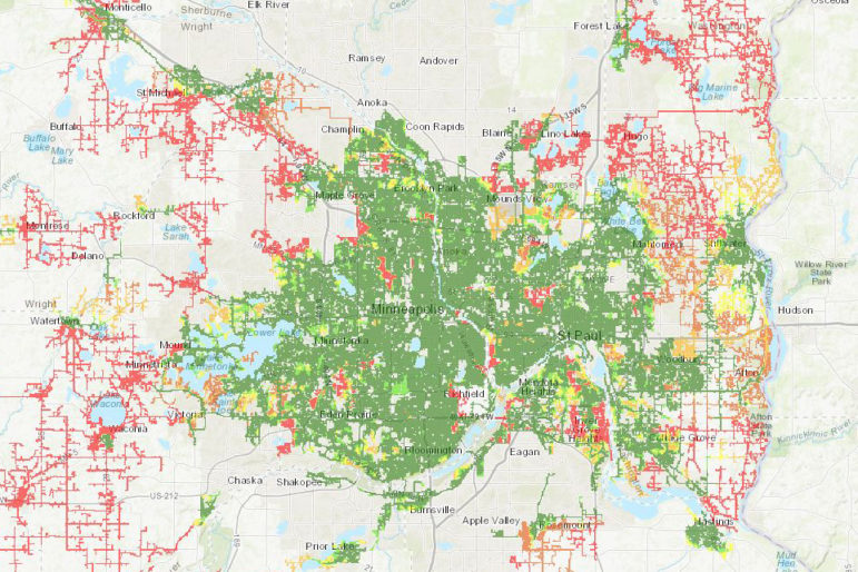
This year’s version, after stakeholder insistence from Fresh Energy and others, is accompanied by a map! The image at the top of the post is a snapshot of Xcel’s twin cities service territory. The colors range from the dark green areas which have a hosting capacity value of over one megawatt (>1MW) to the red areas which have a hosting capacity value of zero. It’s pretty simple: green very generally means a project should be good to go and red means a project may not be feasible without major upgrades.
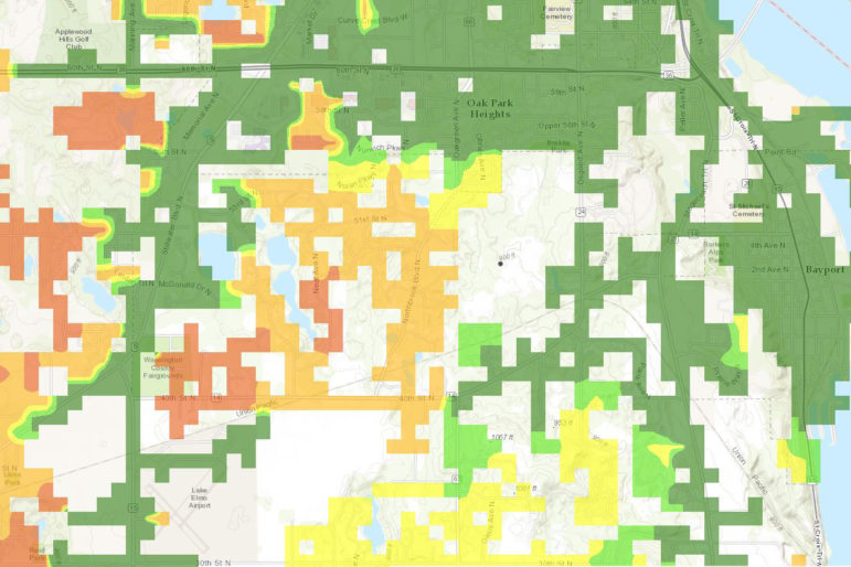
The image below is zoomed in to an area in Baytown Township. The level of detail is impressive! As you can see, the colors generally follow the feeder lines where a distributed energy resource would electrically connect to the grid. With access to this information, a project developer can site a project where interconnection is most likely to be quick, easy and inexpensive.
In addition to the map, the analysis includes a spreadsheet of data with a row for each substation and feeder that provides the minimum and maximum hosting capacity value at each location as well as the limiting factor for each (e.g. primary overvoltage, breaker reduction limit of reach, etc.). A developer with power systems engineering chops may be able to use the specific limiting factor information to estimate the interconnection costs required to connect at that given site. But they would need to apply for interconnection and advance through Xcel’s full study process in order for Xcel and the developer to understand the full scope.
How the sausage gets made
Xcel also improved upon their methodology over the 2016 version in a few key ways. This version now includes the distributed energy resources that are operating today (not including standby generators), contemplates some advanced inverter functionalities, and tweaked the methodology to more accurately consider large projects such as solar gardens which are most likely to benefit from the tool.
Where Xcel’s report has fallen short is in their explanation of how this hosting capacity report will be used internally to streamline interconnection requests and benefit distribution system planning, making the effort more worthwhile. We would also like to see a more thorough evaluation of the accuracy of the report as well as more frequent publications. We will be taking advantage of the open comment at the Public Utilities Commission to provide this feedback as well as a few more technical points (yes, it can get even more technical). This report should serve as a critical step toward a more transparent distribution grid where investments in clean energy are much more easily integrated into the electric system further lowering the cost of new generation.